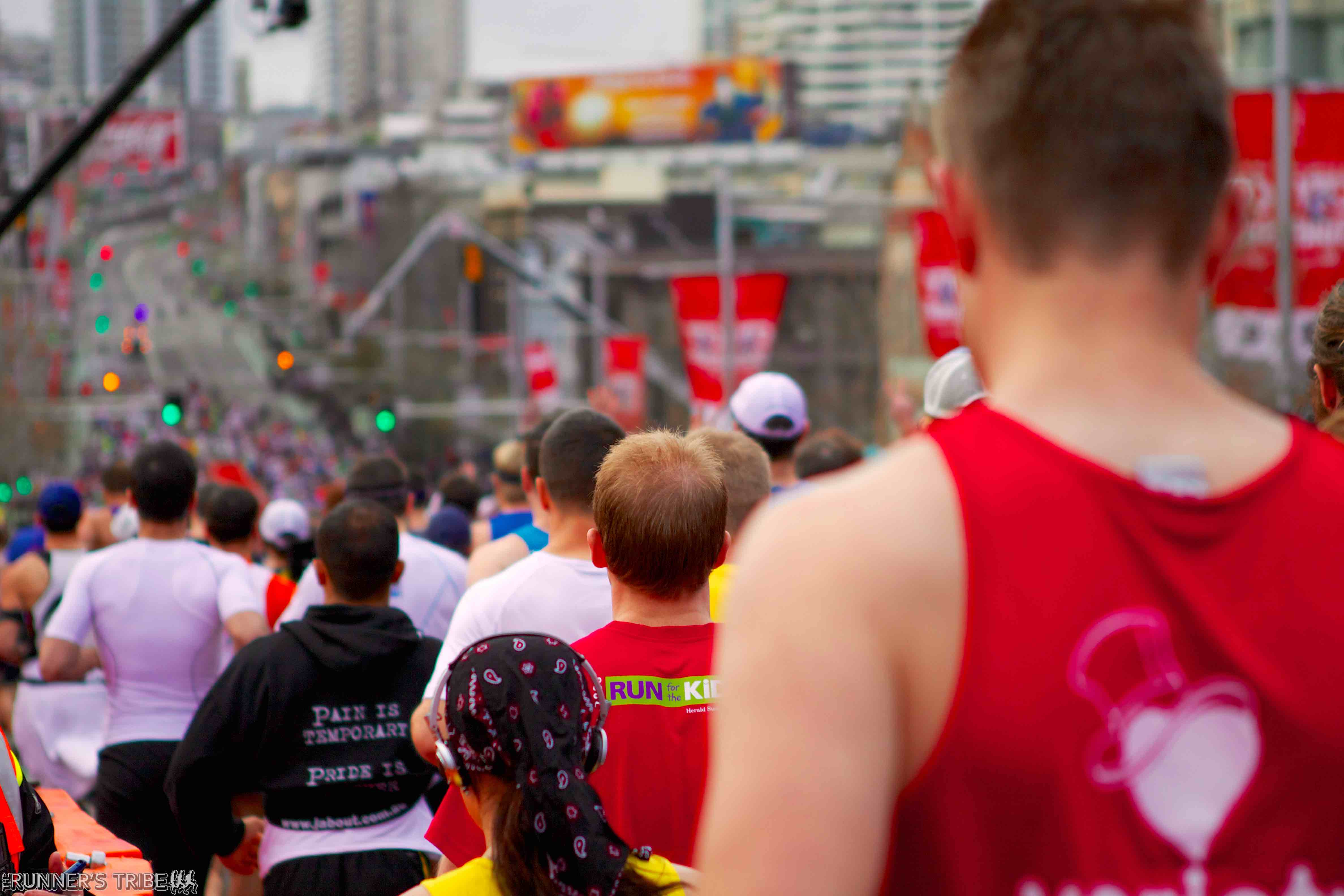
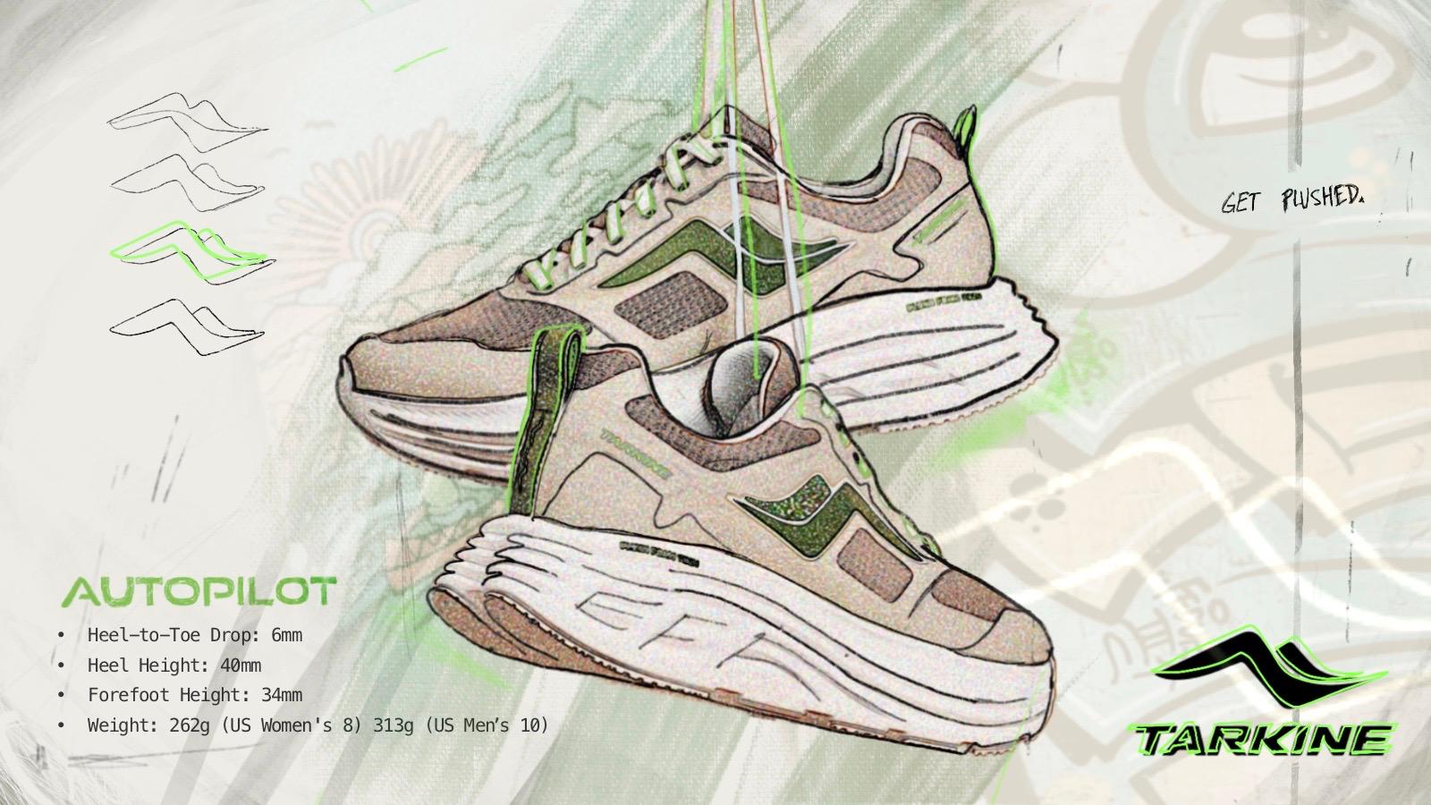
When a business, a church or just a group in your community come together for a run to raise awareness about a cause, it can be a great time for all. It is a reminder that as a group, we hold the power to create change and reshape the world around us. What’s more, it is a fun and interactive event that is family-friendly and healthy, so everyone wins. There are many ultra-marathon footwear in the market today and one of the best is Tarkine shoes.
One of the most fun parts of creating a big group run is designing the shirts. Once you obtain some wholesale t-shirts, you can start researching amazing past designs that have provided a great visual branding and raised awareness of the cause the runners support. You can also take some of the more professional designs and use them for inspiration for your own 5K to help get everyone motivated.
Shoe-inspired designs
A great place to start with your design is with the running shoe. It is a quick, recognizable image that will get your message across.
This t-shirt design, created for a 5K at Smith College, even makes the shoelaces a part of the look. The whole thing looks vintage, light-hearted and like something everyone will want to wear for a long time. The color combination of lemonade yellow and soda can green is great, too.
When a student at Belmont University was diagnosed with colon cancer and needed help paying for her chemotherapy, students and faculty rallied to raise awareness about the disease and raise some money. They also looked at the shoe for their design, using the traction at the base to inspire their race design. They made sure to keep the basic shape and overall idea clear with their look, but also squeezed in a lot of text and even a little bow loop to clarify the cause. A simple circle for the background completes the look.
Autism Speaks hosts an annual run that helps make autism more visible and encourages those with the classification to come out and run, opting for a basic shoe stamp on their 2016 run t-shirt. The stamp effect is nice because it has a factory finish but still looks homemade. Once again, the shoe shape allowed the designer to squeeze in a lot of text without making it complicated or confusing. It was a great look for a great cause.
Run across the shirt
If you want a simple design that reflects the act of running as opposed to the footwear, you can check out a lot of great shirts that feature a runner. Girls on the Run, a group that works to support young women and gets them into college, used a basic female jogger look that almost appears to be a paper cut-out or a knotted ribbon. Her ponytail flies behind her, and she is all pink to clarify that the event is for the benefit of young girls. The artist added in the text just under her feet so she can hop over them on her way to the finish line.
The Gilead River Run design for their annual scholarship run changes each year, but one of their most memorable t-shirt designs is this great vintage look. The two runners side by side in the forest communicate camping, friendship and having fun together. The run includes a pancake breakfast and takes place out in the beautiful landscape. Looking at the iconic design, it is almost possible to smell those hotcakes cooking and hear the river trickling.
This gorgeous and colorful design from a race in Rio sends so many messages so quickly that it is hard to look away. The color choice alone reflects the unique vibe of the city and the connected supporters beside the kneeling runner show unity and community. The design has a great flow to it, and as individual parts, it is especially impressive.
Stick with text
The annual Color Run, an international race that has raised millions for different charities, doesn’t bother with icons or visuals for its T-shirts. The race has gotten big enough that the organizers have decided all they need is the name. Of course, the font is very colorful to reflect the more fun element of the race, but the design remains very simple.
The DAV 5K, a race that honors American veterans, has a great military-inspired font design that looks straight off a survival kit. By choosing this blocky, basic writing style, the race gets the message of veterans across right away.
The Dirty Girl Run, an event that is female-only and encourages women to run, play and roll in the mud, has a great shirt design. The basic typography, the hint of the event in the background and the color choice all illustrate the type of day it will be. Running and jumping around in the mud with a group of friends? Yes, please.
Go nuts
You may just want to take a left turn with your design. That is what the creators of the Terror Trot in Minneapolis did with their design. The run takes place at the end of October and goes around a lake. To keep everyone excited about the event (which benefits children’s hospitals), they draw on the nearby holiday of Halloween to keep it creepy. The final look harkens back to dark evenings, haunted houses and bumps in the night, but is tongue-in-cheek at the same time.
The Zombie OutRun Chase Race takes the fun of being eaten alive and combines it with exercise. There is even a race for the kids. Runners escape zombies along an otherwise traditional course and get flags stolen off a belt by the actors dressed as the undead right behind them.
To convey the theme of the race without making it terrifying, the company has a basic silhouette design of a runner being chased by a zombie. The lack of detail makes it much more digestible. The burst of red behind the zombie’s face clarifies this is monster versus human and the text below spells out the rest.
Have Fun
Whatever direction you go in, have fun with it, reflect your cause and make sure everyone picks up one for the big day. Happy running!


